I have been planning my trip to Paris to visit Maison et Objet this September and have therefore been spending a lot of time scrolling through airbnb listings. As you can imagine I am the visual type (surprise!) and design is the main driver next to location that prompts me to press the “book now” button. Apparently I am not alone in that but after many years of booking holiday rentals I still have the feeling that design as a central element to drive bookings is being overlooked by most. Of course, if you are really renting out the place that you mainly live at while you are on vacation, then by all means ignore me. You should absolutely live whatever way you want! However, if you are regularly renting out a holiday property in order to earn extra income, then you should definitely pay close attention how you design the place. Because just placing your cast off furniture in an apartment, taking bad cell phone pics and then charging EUR 130 a night is not going to ensure you have a great booking rate.
So please let me help you out here so you can get the best return out of your holiday rental and follow these easy steps to make sure you leave no wishes open in the design department. Oh, and I’ve tried to make it as affordable as possible without compromising on style because I know all of you have your eye on the newest handbag or technical gadget you ABSOLUTELY need!
Before we get started though some advice: if you are furnishing a vacation rental be aware that design drives booking rates but functionality is key. You need to make sure that your key pieces are functional, wear well and don’t stain too easily (get the high quality fabric and pay extra for scotch guarding your fabrics – it will pay off in the long run). Now that we have the boring stuff out of the way let me get into the design of the living room of your holiday rental (I’ll do the bedroom in another post otherwise this will get to long and you will get bored):
Step 1: Choose Your Key Piece
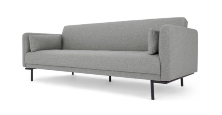
When designing your Airbnb I advise you to start with your key piece in a neutral color. You need to make sure the size and function fits the needs of your ideal target clients. In this example we are starting with grey sleeper couch that can host two additional people in the living room.
Step 2: Use A Harmonious Color Scheme
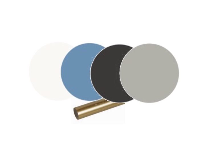
Choosing a theme or a color scheme for your short term rental makes creating a cohesive design scheme throughout the property easy. Lets go with a sophisticated color scheme consisting of a mix of greys, blues, black and white with gold accents for this example. You can exchange blue for any other color (it is really hot right now and blue seems appealing to me) but be consistent. Use a variety of hues of that color and different textures to keep things interesting. By using neutrals plus one other color it keeps things visually simple.
Step 3: Add Character With An Accent Wall
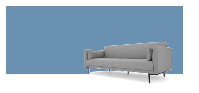
A single accent wall can instantly add character to a space without breaking the bank. I decided on using Cooks Blue by Farrow & Ball for the accent wall in the living room of our sample Airbnb . If you don’t want to shell out for a premium brand – which I completely understand – you can have the color colormatched at most paint shops.
Step 4: Choose your other big furniture pieces: I added a round table that seats four. It is enough for a one bedroom apartment and I always find round tables add more charm and drive conversation. Plus it is more cozy should only two people book the apartment. This small dining table by Westwing takes up our color palette, has a great size (not too wide at 105cm) and has visually interesting legs (I saw a lot of these kind of table legs in Milan last year and now the shape is arriving at retailers near you…Hurrah!). I then added a round coffee table in black wood to mirror the shape of the dining table. I also used a round, black side table next to the sofa. Always repeat shapes in a room – repetition is key to creating great design! The other big furniture piece is a dark blue sideboard with gold handles and legs.

Step 5: Choose seating. I added four dining chairs covered in blue fabric. I also added a blue cocktail chair to the sofa to create a conversational area. Cocktail chairs are more affordable than lounge chairs, come in great colors and designs and work well in a holiday apartments (which are often on the smaller side).

Step 6: Have fun with fabrics. Now is the time to add soft furnishings. Use ready-made store bought curtains that can be easily shortened to save some cash. Get a well-sized rug as a basis for the conversation area – in this case bigger really is better! Add three nice throw pillows for the sofa (why three you ask? Uneven numbers draw the eye along the room – basically your brain keeps looking for the fourth pillow and remains engaged). Ideally get two subtle pillows in different sizes and shades of your main color and one throw pillow that displays a bit of personality to create interest (I really love h&m home for finding interesting, fashionable throw pillows!).

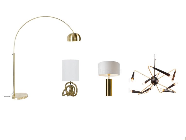
Step 7: Let there be light. I already decided in step 2 that I wanted to use gold in my color palette so using this in the lighting is logical. You need basic lighting (the lamp above the table if you don’t have built-in spots), task lighting (for reading on the sofa) and mood lighting (to well get in the THE MOOD – people are on vacation after all). I added lighting in white, gold and black- that keeps things consistent and visually clean. I particularly love the Mini Knot Table Lamp in Soft Gold from One Kings Lane- such an interesting shape!
Step 8: Add personality and accessorize like your life depends on it. Bringing in an interesting mirror that adds personality and draws more light into the room is always a win. The big, round mirror has an interesting frame that repeats the circles we have going in the tables and has gold touches to boot! Art is a great way to add personality to a room and it doesn’t have to be expensive. There are some great online resources for art prints that you can check out (I particularly love Minted and Juniqe). In this design I wanted to bring in references to the location of the apartment (Hello beautiful Vienna!) and decided to use posters of the Albertina Museum which has fantastic modern art exhibitions. These posters are a great size and you can easily pop them in a store-bought frame. Just don’t forget to add matting – this is the trick to make cheaper pieces look high-end.

So, are you ready to see how all of these elements come together? I´d love to show you!
Et voilà! Now we have a beautiful, stylish living room in our holiday rental that will look good in online pictures and prompt people to book your apartment. Also, a well-designed place where they feel at home will entice guests to stay at your place again the next time they are in town and to recommend it to friends. So what does this look cost? Before I reveal that, keep in mind that furnishing a rental place well is a long-term investment! So all in all creating this look costs around EUR 4700,-, which I think is quite good for an entire living room.
Now go and furnish your holiday rental! Leave me a comment if you want to have the link to one of the products featured. And if you don´t know what you want it to look like or don’t want to do it all yourself, you can always contact me
